While I would say that I personally do not have a favorite color, I recognize that I am drawn to using my own interpretation of French Blue Gray as a starting base for numerous projects. I find it to be a soothing neutral that is both aqueous and celestial. Something in the element of this color brings me to the inner essence of stillness as if floating. It acts as a balm to counter the erratic sounds and movements within the day.
Blue comes from the Old French “Bhle” which actually means light colored. I find this amusing seeing as all the French reproduction pieces from the furniture industry are white washed. The name “French Blue” first came into use in 1802 and actually refers to a deep azure color associated in the heraldry of French kings.
 I prefer a gray interpretation of French Blue and find that Farrow and Ball of England has mastered the color with a splendid sweep of gray to blue to soft green. Try their Mizzle, French Gray, Blue Gray and Pigeon. Benjamin Moore offers White Whisp, Gray Lake and Gray Cashmere. Remember, if you love the color but it feels too dark, ask your local paint supply store such as Steinkellners on North Ave to mix it ¾ or ½ strength for you. Play with a few shades on the wall and live with them from full sun to full shade and see how they affect your mood.
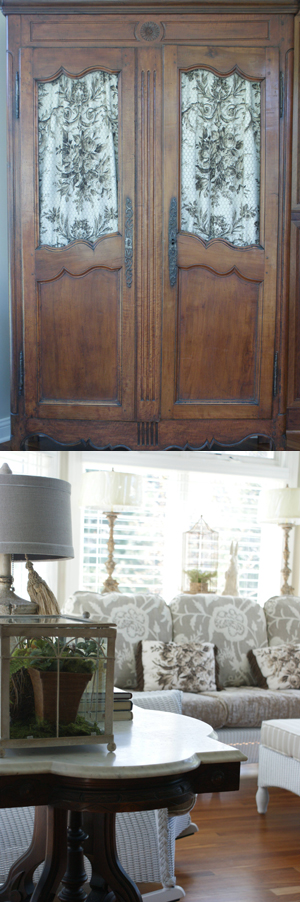
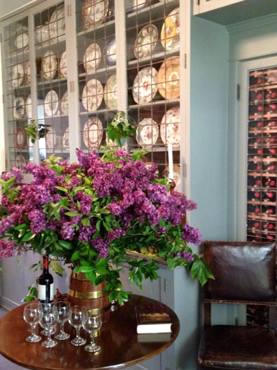
Where you put this quiet color is a personal preference. I have been using it everywhere but walls including doors and built-ins and loving the look as it plays off of an antique burlwood, pecan or 19th century pine. I am currently using it on our newest kitchen display in the shop paired with a gold wash, a touch of umber and a brown bee wax finish. Remember to sign up for eblasts and I will send you a picture of the finished display – or stop in to visit on a Friday or Saturday. I am sporadically in the shop Tuesday through Thursday now that we have started the Brookfield remodel job which includes kitchen, bathroom, library, living room, mudroom, garden room, game room and den. The design will be a white on white palette but I can already tell you that all of the interior doors will be FRENCH BLUE and our artwork in shades of azure.

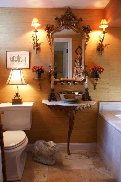 If you are planning a small bathroom which lacks natural light, embrace the masculine and employ dark, rich tones rather than try and fool the eye with all white on white. The truth is, you can’t fool the eye. Small is small and dark is dark but neither has to be a negative. Small can feel sheltered and dark can feel tranquil and quiet. Sounds like a great place for a long, hot bubble bath after a long work day.
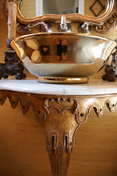 in marble tiles. The tiles were less expensive than a solid stone top and side. Gold grass wallpaper was hung and reflects what little light is available and plays off the camel tones with the drapery, artwork and accessories. The gold branch sconce lights were used throughout the home for continuity and add an organic element to the room.